How I designed my first data visualization project: UX case study
Introduction
What’s Firstnaukri?
Firstnaukri is a job platform owned by Naukri, a popular choice for job seekers. Unlike Naukri, which caters to all levels of experience, Firstnaukri specifically helps college students who are seeking their first jobs.
Who are the users
Firstnaukri has 3 user groups
- Students: Their objective on Firstnaukri is to learn and find a job.
- College Placement Officer: Their objective is to get maximum job offers for the students in their college. They use Firstnaukri to reach out to companies.
- Recruiters: Their objective is to find the right talent.

This project is primarily aimed at College Placement Officers. It also helps recruiters.
An important point to highlight
Over the past few quarters, our main goal has been to shift from being just a place to find jobs to becoming a platform that supports careers. This means going beyond job hunting and offering tools to improve candidates’ skills and readiness for the workforce.
To achieve this, we’ve introduced several features aimed at helping students prepare. Some important features include readiness tests, contests, webinars, a resume builder, and Q&A sessions for personal interviews.
About this project
Project Brief:
Create a reports page for Firstnaukri where users can generate reports of the students who have appeared for the readiness test based on different parameters like YOP, Courses, Roles, etc.
Objective:
- Help Placement officers assess the performance of their students and accordingly train them or call the relevant companies
- When companies open the report, they should be convinced to go to the universities to hire candidates.
My role:
Ideated and built this project from scratch as the sole designer working on this project. I wore multiple hats and worked on primary research, secondary research, Ideation, User flows, Wireframing, UI design and prototyping. I worked closely with the product managers, developers, Business head and Sales team to ensure a smooth and successful design cycle.
Enough backstory, let’s start with the process now.
Understanding the readiness test
What’s the Readiness test?
I first started by learning about the readiness test.
Readiness test is an assessment designed for college students to gauge their readiness for various job roles. It evaluates a range of skills, including aptitude, verbal ability, and specific skills relevant to different roles or industries. The test aims to offer students insights and recommendations about fitting career paths or areas where their strengths can shine, guiding them in making informed decisions about their future careers.
Data we get from students
Overall results are divided into the following 4 categories based on total score:
- Exceed expectations
- Meets expectations
- Partially meet expectation
- Not meet expectations
There are multiple types of readiness tests based on company type, there are different roles and in these roles, students are assessed on different skills(typically 4–5). Some of these skills are common in different roles

Students also get individual scores for each skill.
Understanding the users
Who are the end users?
From the previous research that has been done, we know our main users are Training and placement officers in Tier 2 & Tier 3 colleges. Usually, some college staff or a college professor is given this responsibility. They aren’t very tech savvy and their main objective is to get maximum students placed.
This product will also be used by recruiters to judge the students of any college and decide whether to hire from that college or not.
Interviews & existing models
To understand user’s expectations and needs we interviewed over 10 Training & placement officer from Tier 2 & Tier 3 colleges. We also talked to 5 recruiters who hire college students from different companies.
We asked few of the following questions from the campus placement officer:
- Can you walk me through your current process for assessing student performance and facilitating placements?
- What are the key challenges you face in evaluating and presenting student performance to companies?
- How do you engage with companies to attract them for campus placements? What information do they usually request?
- What steps are taken to upskill students and prepare them for placements?
- What tools or software do you currently use to manage student performance data and facilitate communication with hiring companies?
- Are there any pain points or limitations with the existing technology you use?
Based on the interviews we created user stories to address all the requirements of the users:
User stories
- As a Campus Placement Officer, I want to analyze final and pre-final year students’ performance across courses and company roles to assess readiness and areas for improvement.
- As a Campus Placement Officer, I aim to view reports on students’ performance in specific company types and roles, aiding in evaluations and sharing successful matches with relevant companies.
- As a Campus Placement Officer, I need to filter and review student performance based on graduation year, courses, and company roles to align skills with industry needs.
Our product will also be used by recruiters, so we also created a user story for recruiters based on insights received from the interviews.
- As a Recruiter, I need reports detailing student performance in my company type and roles that I am hiring for to find candidates aligning well with our job requirements and industry needs.
Competitive analysis
I wanted to understand how other data visualizations work. Since I couldn’t find any direct competitors. I went ahead with checking out other data visualization pages. Even, if they aren’t related to test reports and recruitment.


These were my few key takeaways
- Basic charts like Bar, Line, and pie are most commonly used.
- The whole page although has different sections is at the end one single piece of story and usually at the top general insights are provided, as the user dives deep into the picture more details pop up.
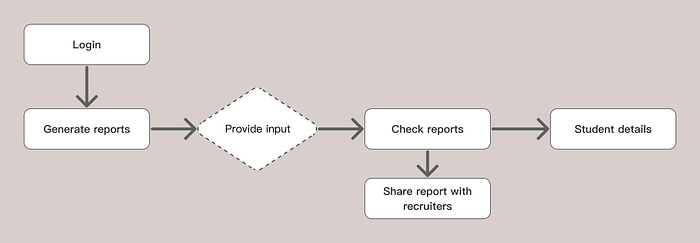
User flow

Brainstorming on the input
We have 4 input data points
- Year of passing
- Course
- Company Type
- Role (The way the readiness test is designed, role is a subset of company type)
The input data points are 4. Now if we use permutation and combination, the number of possible reports could be 11(4C2 + 4C3 + 4C4). But that will make our system very complicated and confuse the user. So, we set the following two limitations:
- Year of passing has to be a mandatory field (Reasoning: Reports should be generated for similar students, there’s no point in comparing students who are at different levels.)
- Other than Year of passing users have to specify one more data point.
Due to this the number of possible cases came down from 11 to 5.
Brainstorming on the output
Now with the inputs finalized we decided to move to imagine the output screens the possible output data points were:
- Number of students who are in the 4 major categories (Exceed expectations, Meets expectations, Partially meet expectation, Not meet expectations)
- Performance across different roles and different company types
- Performance in different skills across roles
- Top performing course
- Company type and role for which my students are performing the best
For the sake of simplicity, we will continue this whole discussion for only one case, same process was followed for other Input cases
Possible data points for Case 1: YOP and course
- Total number of students
- Gender wise split of students
- Overall performance summary of students
- Performance of students across company types
- Company types in which students are performing well
- Performance of students across roles in a particular company type
- Specialization of top performing students
- Performance in different skills
- Performance of different specialisation for each skill
Iterations on data points
Once the data points were identified, I went to discuss with the product manager about the important data points and how the story of our page will flow. On that basis we finalized the following data points.
- Total number of students
- Overall performance summary of students
- Performance of students across roles
- Specialisation of top performing students
- Performance in different skills
- Performance of different specialization for each skill
Learning about Data visulaisation
Once the data points that had to be represented was finalized, I started figuring out the right data visualization (Charts, plot, graphs, and infographics) for each plot. I haven’t worked on any data visualization project and it’s been years since I last studied these different plots and charts. So, I went to revise and learn about all the different data visualizations.
Final designs

— — — — — — — — — — — — — — — — — — — — — — — — — — — — — — — —

— — — — — — — — — — — — — — — — — — — — — — — — — — — — — — — —

The iterations
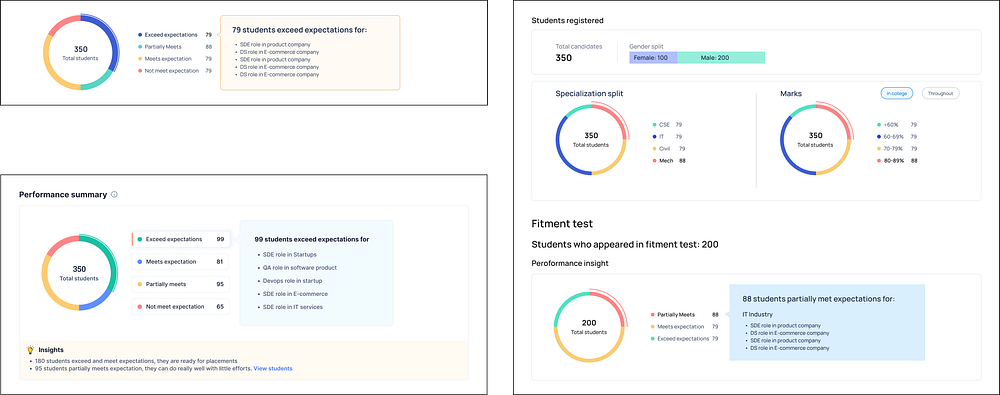
We created multiple iterations of all these pages and had multiple rounds of feedback before finalizing the designs. You can check out a few iterations here.


For the report page, we created multiple iterations for each section.
Few iterations designed for the summary section at the top were:

Impact & What’s next
We managed to onboard 40% more users and 30% growth in revenue within a quarter although this was the result of several other projects that went live.
Regarding, this project we are still measuring the metrics and trying to understand user behavior.
My learnings
This project was a very challenging one and it taught me a lot about design, navigating the discussion with stakeholders, and understanding users. A few key skills I developed are:
- Storytelling with Data: I developed the ability to tell compelling stories through data, presenting insights in a narrative that resonates with the audience.
- Real-World Application: I gained exposure to real-world applications and contexts in which data visualization plays a pivotal role in decision-making and problem-solving.
- User-centric approach: I learned about the importance of user needs and preferences in data presentation, ensuring clarity and relevance for the audience.
Thank you
Thank you so much for taking the time to read through this case study. If you have any queries or any doubt, feel free to connect with me.
Here’s the link to my portfolio: https://heyneeraj.com/
